

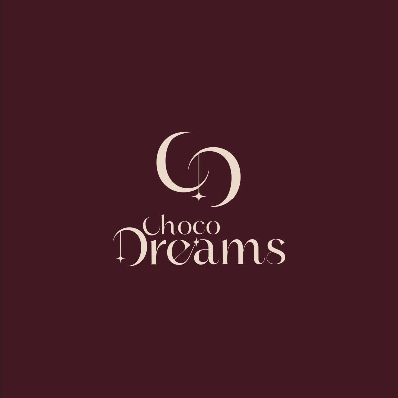
At Nexel, we crafted the brand identity for Choco Dreams to e goal was to build an elegant and soft mbody a world of luxury, warmth, and dreams blended with chocolate. Ourvisual identity that reflects the store’s unique experience and premium products.
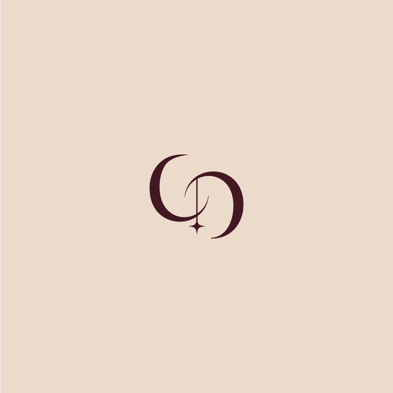
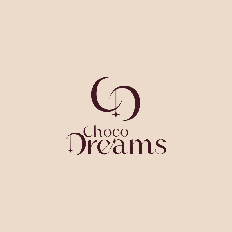
• We designed the icon by merging the letters C and D in a smooth geometric style, forming a crescent-inspired shape that symbolizes dreams, imagination, and the warm emotions connected to desserts and chocolate.
• The crescent element represents calmness, elegance, and comfort, reflecting the idea that the brand offers more than just sweets — it delivers a memorable experience.
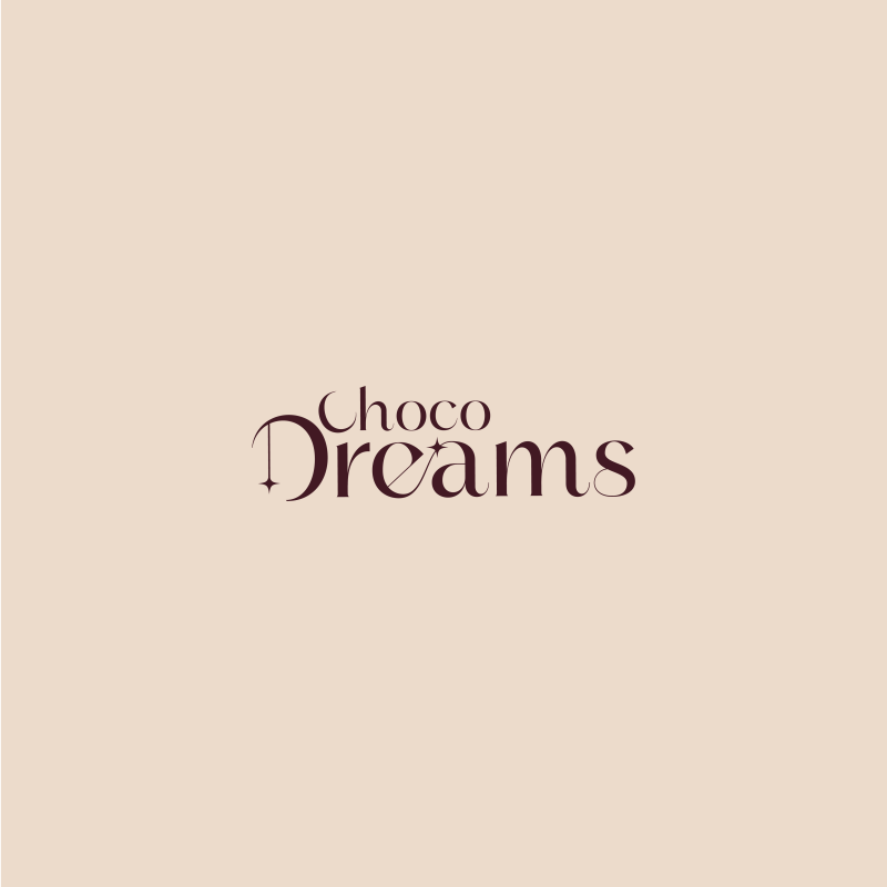
• We used refined and luxurious typography with delicate details to give the identity a sophisticated and visually appealing character that aligns with the brand’s premium products.
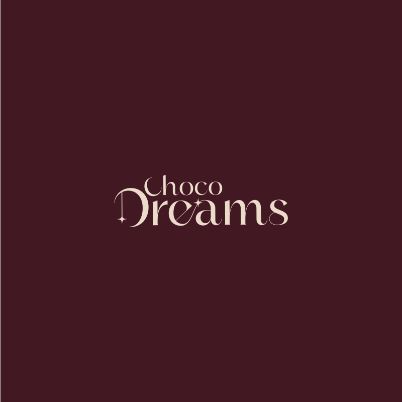
• The deep burgundy color was carefully selected to convey luxury and richness, while the lighter tone adds warmth and elegance inspired by the world of fine chocolate.
• Sparkling star details were integrated into the logo to symbolize dreams, magic, and distinction, strengthening the connection between the name “Dreams” and the visual identity in a creative way.
• The team at Nexel ensured the identity remains flexible and adaptable across packaging, boxes, bags, social media platforms, and the online store while maintaining a strong and memorable visual presence.
At Nexel, we don’t just design logos — we create visual identities that express the brand’s personality and leave a lasting impression on customers.
Add New Comment