
General Idea
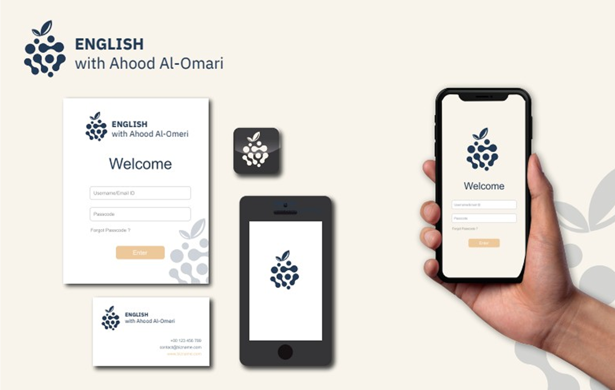
The "English with Ahood Al-Omari" logo draws inspiration from the mulberry fruit, featuring a modern visual design that balances simplicity with depth. It reflects a unique educational vision centered on easy learning, enjoyable experiences, and the systematic interconnection of learning stages.
Symbolic Meaning of the Mulberry in the Logo
-
Fun and Flexible Learning
The mulberry was chosen for being light, appealing, and easily accessible—just like education should be. The logo embodies a flexible, straightforward learning experience suitable for all levels. -
Each Berry = A Complete Stage
The logo comprises interconnected circles, each symbolizing an independent educational stage, yet linked cognitively—each stage builds on the previous and leads to the next. -
Interconnectedness and Integration
Like the mulberry, formed by many connected berries, the logo represents the idea that successful learning is the product of connected, inseparable stages, where the student’s journey follows a clear, gradual progression.
Visual Message of the Logo
-
Memorable: A simple, adaptable design free from distractions.
-
Professional and Modern: Clear lines and soothing colors evoke confidence and seriousness.
-
Personal: Featuring the name “Ahood Al-Omari” adds warmth and human connection, avoiding a sterile corporate feel.
Supporting Colors and Visual Identity
-
Dark Blue: Symbolizes trust, professionalism, and stability.
-
Light Beige / Honey: Conveys warmth and simplicity, creating a balanced, inviting visual tone.
Add New Comment