
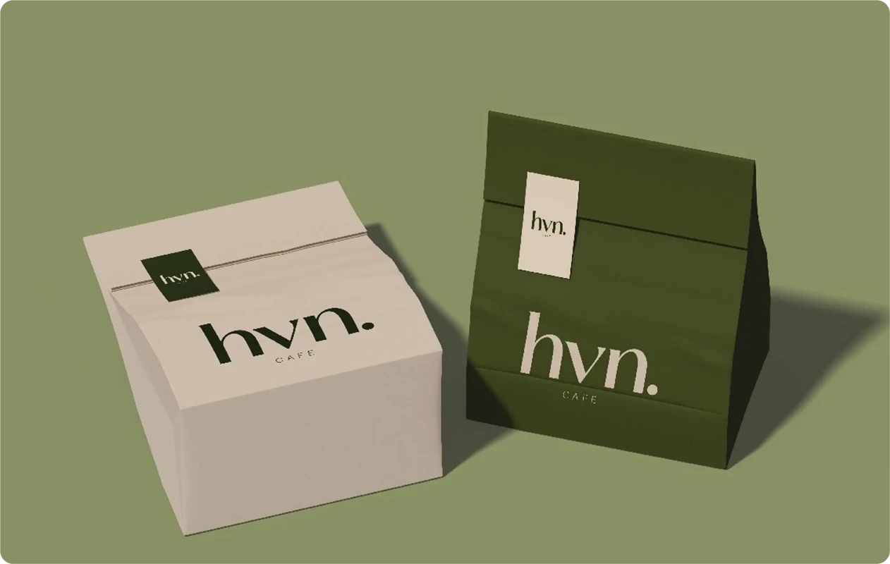
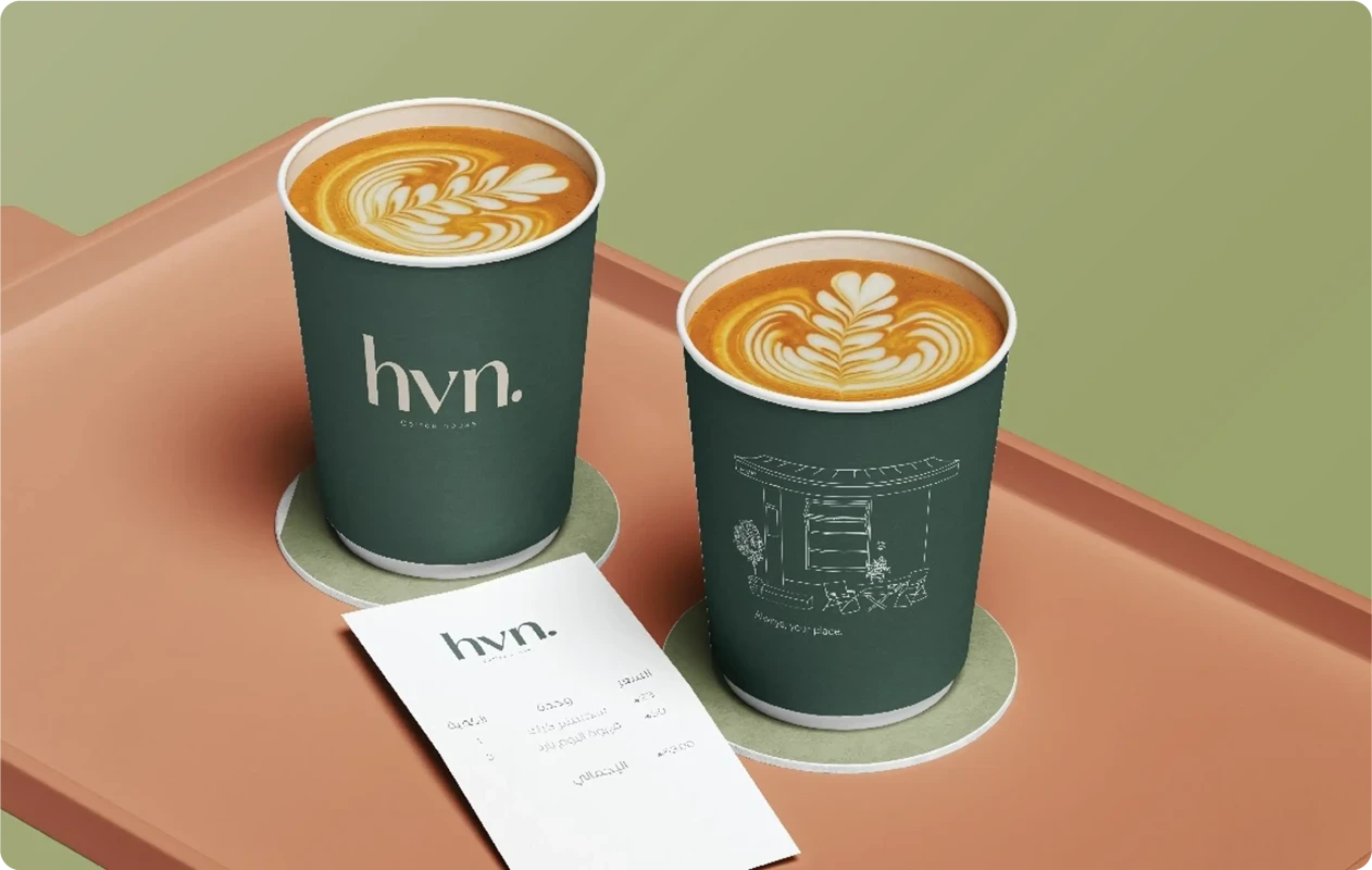
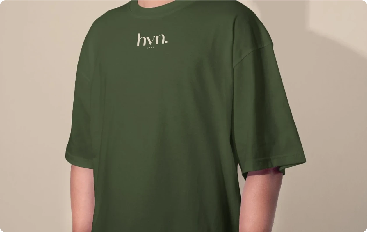
hvn Logo – A Symbol of Simplicity and Warmth in the Coffee Experience
The hvn. logo is inspired by the idea of creating a cozy and peaceful space that serves as a “haven” for coffee lovers. It symbolizes the balance between simplicity, fluidity, and warmth that defines the café experience. The logo combines soft lettering and calm colors to reflect a unique visual identity that feels close and relatable to customers.
Visual Pillars of the Logo
The logo consists of three main pillars:
-
The abbreviation (hvn):
Represents a modern and minimal identity that is easy to remember and connect with. -
The dot ( . ):
Stands for completeness and clarity, as if placing a signature mark that ends the name with a sense of trust and distinction. -
The tagline (Coffee house):
Directly clarifies the business identity and reinforces the link between the name and the coffee experience.
The Visual Message of the Logo
-
Simplicity and clarity: A sleek, modern design that is easy to recognize at first glance.
-
Warmth and comfort: The chosen colors evoke a sense of calmness and relaxation, just as visitors should feel inside the café.
-
Professionalism and distinction: The design reflects a refreshed identity and a contemporary brand image.
The Meaning
The hvn. logo is not just a brand mark but a reflection of a holistic vision for a café aiming to deliver a distinctive coffee experience:
-
Each element of the logo represents the balance between simplicity and quality.
-
The final dot embodies trust and completeness.
-
The typography and colors express fluidity, warmth, and professionalism.
Add New Comment